ARE YOU MOBILE FRIENDLY?

Back in 2007, around the same time the first iPhone launched, you wouldn’t hear many people using the phrase “Responsive Website Design”, and there’s a good reason for that - there was no such thing. If users wanted to browse the internet on their mobile device, they’d have to pinch and swipe to navigate around a page designed to be viewed on a desktop computer screen.
For those who are unfamiliar with the term, Wikipedia describes Responsive Web Design (RWD) as “an approach to web design aimed at crafting sites to provide an optimal viewing and interaction experience across a wide range of devices (from desktop computer monitors to mobile phones).” Essentially, RWD aims to make it easy for users to consume website content on mobile devices by minimising the need for them to resize, pan, and scroll.
For a number of years prior to the launch of the first iPhone, the website design industry had been evolving, and new terms like "flexible", "liquid", "fluid", and "elastic" were being used to describe a website layout which would adapt to different screen sizes dynamically.
Although somewhat lacking in functionality, the first partly responsive website, Audi.com, came to life in 2001. It wasn’t brilliant since it didn’t work well across different browsers, but it was a start.
Surprisingly, it wasn’t until 2010 that the phrase “Responsive Web Design” came into play - which is quite surprising when you consider how important it is to us digital marketers now!
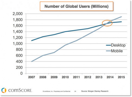
In December 2012, Mashable named 2013 as the year for Responsive Website Design and a more recent report from comScore demonstrates why it had become such an important design approach - the number of mobile users was about to overtake the number of desktop users!
If this isn’t enough evidence to persuade marketing professionals that they need to be thinking about their mobile strategy, perhaps the news that google are punishing non mobile-friendly websites is a more convincing argument.
The mobile industry doesn’t seem to show any sign of slowing down. Forrester predict that there will be 3.5 Billion Global Smartphone Subscribers by 2019 as emerging markets also look to join the mobile revolution.
Despite all of this data, 6 in 10 consumers still don’t feel that their mobile expectations are being met by the organisations they do business with and a report from Vanson Bourne states that 93% of those consumers take action as a result of their expectations not being met. Those actions include:
- Complaining
- Purchasing from a competitor
- Informing others of their poor experience on social media
- Requesting compensation
- Never attempting to purchase from the company again
Does my organisation need a responsive website?
...Yes!
...That might sound like a bold, unfounded, statement but we’re about to put your website to the test.
Test 1: How much mobile traffic does your website receive?
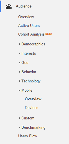
1. Head over to your Google Analytics account.
2. Select a suitable date range (3 months should provide a reliable data portion for most organisations).
3. Under the audience tab, select “Mobile > Overview”.
4. Make a note of the number of sessions that took place during the period (Displayed in the main window). This will be broken down into desktop, mobile and tablet users. It’s also a good idea to make a note of the percentage each figure represents.
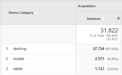
This screenshot was taken from our google analytics account. We provide a B2B service, so we fully expect for most of our traffic to come from desktop computers (most likely between the hours on 8am and 6 pm). Having said that, it would be pretty foolish to ignore the 10% who are viewing our site on a mobile device - that's over 3000 sessions, which could equate to a lot of sales leads!
Test 2: Are you providing a good mobile experience for your users?
Once you’ve established that there is substantial mobile traffic to your site, it’s worth looking at your bounce rates, exit rates and time-on-page. Compare the figures for mobile and tablet against desktop visitors (it’s all on the same Google Analytics page you navigated to for Test 1). Do you notice a substantial difference between them? If so, it’s a pretty sure sign that your visitors aren’t receiving a great mobile experience, so you’ve got some work to do!
Is your mobile traffic growing?
Whilst you’re in Google Analytics, it’s a good idea to compare your current mobile traffic (found in Test 1) to the traffic for the same previous 10 periods - that’ll give you a good idea of whether or not your mobile traffic is growing. If it is, it's time to go responsive.
Go responsive!
Consumers are immersing themselves in Mobile Technology and as Marketers we need to understand the importance of how this affects our digital strategy! If you followed all of the instructions above, you’ll already have some convincing information to take to the board of directors to prove the need for a Responsive Website Design. When you’re ready to take the next steps, be sure to get in touch - We’d love to assist!
