UNRESPONSIVE WEBSITES ARE DOOMED

On 21st April 2015, Google announced the roll out of their mobile-friendly update, a transformation that will boost the rankings of mobile-friendly pages on mobile search results.
Needless to say, the announcement comes as a welcome change to organisations with a mobile friendly website, but what about the rankings position of those organisations that haven’t yet developed a separate mobile site / introduced a responsive design into their existing website???
What about all those years of hard work you’ve put into improving your website’s SEO???
…Well, if responsive sites are climbing the rankings, unresponsive sites may be doomed to the murky depths of Google’s unchartered territory - page 2 of the search results!!!…*queue sounds of shrieking Marketers*
Perhaps the word “doomed” is a little strong. Google did hasten to add that the intent of the search query still carries a lot of weight in terms of ranking position, but in such a competitive environment this change will undoubtedly draw a divide between the good websites and the great websites.
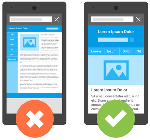
If you’re unsure of what the term “responsive design” actually means, the visuals below put it simply.
http://googlewebmastercentral.blogspot.co.uk
An unresponsive site will appear similar to the image on the left: the entire webpage is shrunk to fit the size of the screen. On the other hand a responsive design (image: right) will provide an optimal viewing experience across a wide range of devices since it’s easy to read and navigate, and requires minimal zooming and panning. In summary, responsive design dramatically improves the usability of websites on mobile devices, and helps to vastly improve mobile-user conversion rates. But with Google’s latest announcement, responsive design just got a lot more important.
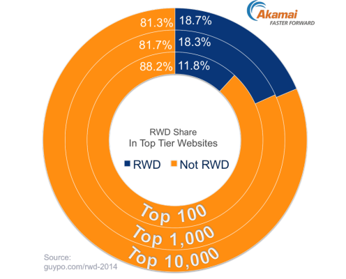
In a previous post, titled “5 Key facts about the mobile market”, we meticulously analysed the explosive growth of smartphones, and the general decline of desktop usage. Despite the warning signals identified by such research, a significant portion of the web still lives in the dark ages. In fact, the following image, taken from a 2014 study, found that just 18.7% of the top 10,000 websites were found to be using Responsive Web Design (RWD).
As a modern digital marketer, you’ll undoubtedly have a solution in place which allows you to monitor the percentage of mobile traffic to your website (Google Analytics makes this easy). This metric should not be overlooked. If your mobile traffic is already substantial, a responsive site is imperative. If it's not a substantial figure yet, it's worth remembering that it's still a rapidly growing market, and sitting at the bottom of Google isn't going to be doing your growth strategy any favours.
You can check whether or not your website is optimised for mobile by dropping your domain name into Google’s assessment tool.
As a professional website development agency, 3chillies would love to hear from you if you’re looking to go responsive.
