REBRANDING 3CHILLIES
 As we celebrate our 10 year birthday, we thought it was time for a rebrand to reflect how we are growing as an agency.
HISTORY OF THE 3CHILLIES BRAND
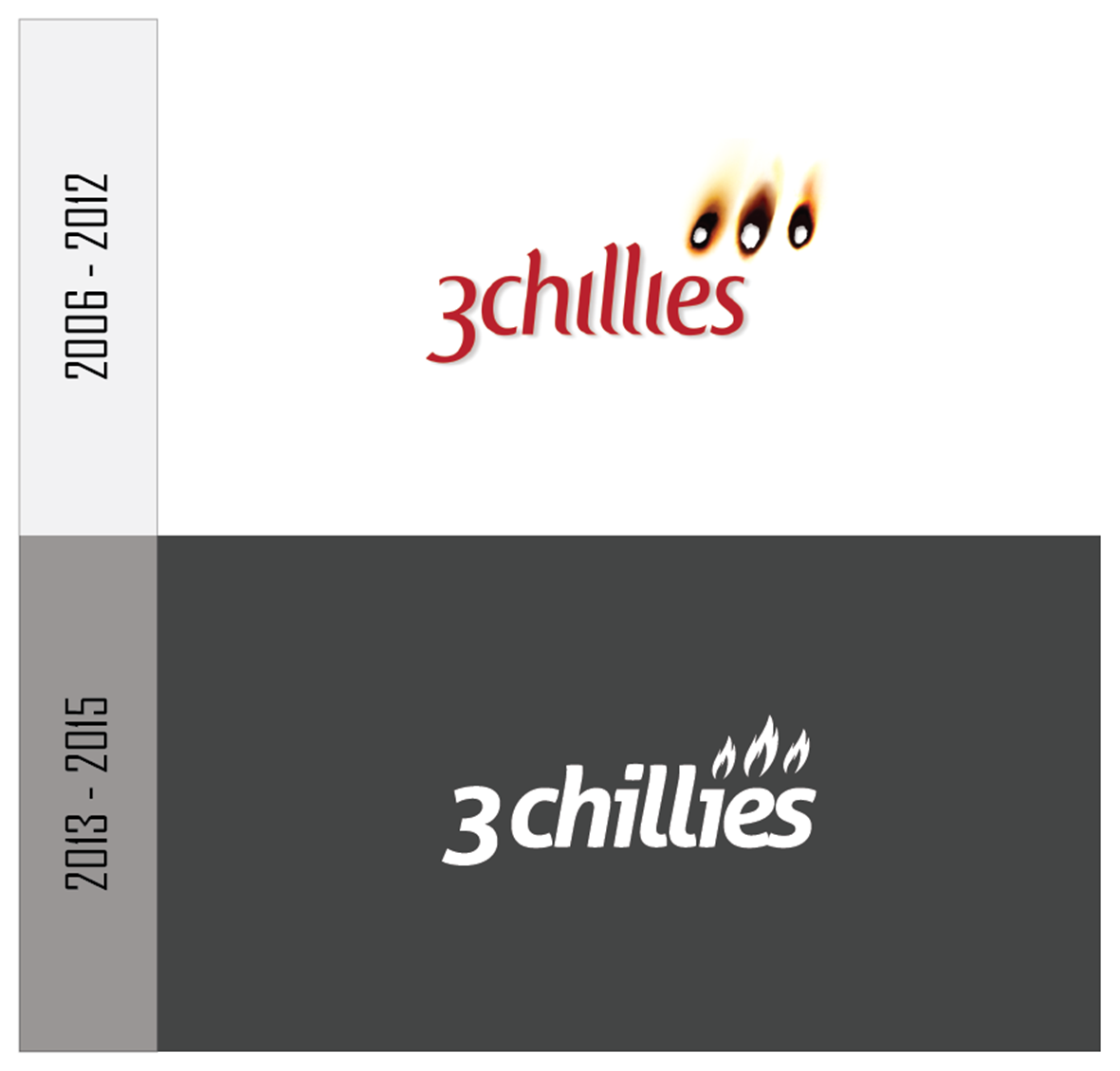
It all started back in 2006 as Paul Spearman and Bryan Archer sat in the local curry house mulling over their plans for setting up their very own development agency.
A name for the company hadn’t yet been decided upon, and with the imminent registration paperwork approaching ever closer, it remained the single missing ingredient in the plan.
The name had to be energetic, young at heart, unique and memorable. These are the values that would be reflected in the kind of company that both budding company directors had in mind.
Sharing a love of hot food they gazed into the menu, searching for the spiciest meal they could find. Both sets of eyes flickered between the items labelled with the iconic 3 chilli heat rating symbol, and it was at that precise moment when the 3chillies brand name was brought to life.
SUCCESS WITH THE 3CHILLIES BRAND
It’s difficult to say how much our unique and somewhat unorthodox brand name has contributed towards the success of the company. We don’t doubt that it has helped us gain industry recognition, because unlike many of our competitors, who have slightly more corporate sounding names, the 3chillies brand name is a lot more…extroverted.
The fact is that now, more than ever, we're gaining some serious momentum under this brand. We’re securing more and more impressive names to add to our glorious list of client case studies, and we’ve formed some great partnerships with this brand. Moreover, with the new London office, and a planned Cardiff office opening later this month, we’re very proud of our name and what we have achieved as "3chillies", so we’re sticking with the name!
REBRANDING
Whilst we’re still in love with our name, we do feel it’s time to update our company image. 3chllies has been technically led ever since its inception. However, we now have a solid marketing team in place and the creatives inside of us wanted to shake things up and give us a fresh look. Furthermore, the bridge between marketing and technology draws ever closer, and as client demand's become more sophisticated, so does the technology and strategy that we are helping to implement. What used to be a CMS is now a fully integrated marketing platform. Add that to the fact that we need to ensure all communications are available on so many platforms, and we know we have to change our service set and the way we talk to our own clients.
In 2013 we renovated the 3chillies logo to bring it in line with modern design principals, and now after more research, we felt it’s time for a complete logo overhaul.
LOGO HISTORY
We've enjoyed using the old logo for many years, but our logo needs to reflect who we are and what we do. It needs to scream “Digital Agency” , so it was time for a change.
THE NEW LOGO
Working with our design partners Bluegg, this is what we’ve come up with:
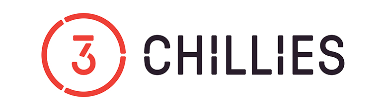
We love it.
The cut-outs provide a subtle link to the digital theme and its industrial feel hints to the fact that we love building things.
The new logo also gives us the ability to use the “3” as unique standalone icon for media branding – a luxury we’ve missed out on in the past.

As well as feeling more digital, we think this new logo makes us look a little more grown-up. We like to have fun, but we’re serious about what we do, and we feel that the new logo expresses our professionalism more accurately. We also feel that the new industrial design reflects the fact that we're expert builders in the digital world.
ROLLING OUT THE NEW BRAND
Now that we’ve started to use the new brand we have the monolithic task of rolling it out across all of our company collateral, email signatures, websites, partner websites, social profiles and everywhere else that holds the old logo.
Realistically this is going to take some time, and the new logo will likely be phased in over a period of time so that we can continue to commit the majority of our time to serving our customers just as we always have.
A NEW 3CHILLIES WEBSITE TOO!
If all of this news wasn’t enough excitement for one blog post, you might also be thrilled to know that we’re currently working on a new 3chillies website design too.
We realise that our image is an important factor in showcasing what we’re capable of, so it’s time for the 3chillies website to undergo a facelift. We're also going to use the latest advances in our chosen platforms, so we will have a working example of best practice and using the latest versions of industry leading software we will benefit from the functionality and insight to speak to our existing and prospective client base.
We’ll be in touch with more details on the new website in the coming weeks, but we’re thrilled that all of these changes are taking place, and we hope that you like them too.
Aside from the branding and the website changes, we’re still the good ol’ 3chillies that you enjoy working with, and we always will be!
